Principles of Design

For our first session on design, our lecture was on Principles of design. The five principles are Balance, Movement and Rhythm, Pattern, Emphasis, and Unity.
I understood this as the most important aspect of design. Some designs follow all five principles, and some may only include one. However, I believe that a design must have at least one of these principles. 

My personal favourites would be Movement & Rhythm, and also Pattern. As an example for both Movement & Rhythm and pattern, architecture was used. I really liked the photos of buildings, so decided to find a few I really liked, especially ones that had the elements of Pattern and Movement and Rhythm.


The first picture is by Michael Paul Lewis, an Architectural Illustrator based in Bristol. The illustration is of the Royal Crescent, which is a row of 30 houses shaped in a crescent, and a rhythm of 114 ionic columns. Designed by John Woods, it is seen as one of the greatest examples of Georgian Architecture.


The next photo is by Agota Kadar, a Travel and Architecture photographer, based in Vienna. She had taken a photo of the Jacob and Wilhelm Grimm Centre, which is in Berlin. It is Germany’s largest open-shelving library and is the library for Humboldt University. It is a massive total of 38 storeys high.


The third photo is by Paul Green, another photographer from Bristol. This photo is of a building in Sydney, Australia. I really liked the concept of taking the photo from a low angle, since (at least for me anyway) it looks as if the buildings are towering over the viewer, almost closing in on them. As soon as I saw this picture, it reminded me of the film Inception and the idea of feeling like I’m in a dream. 


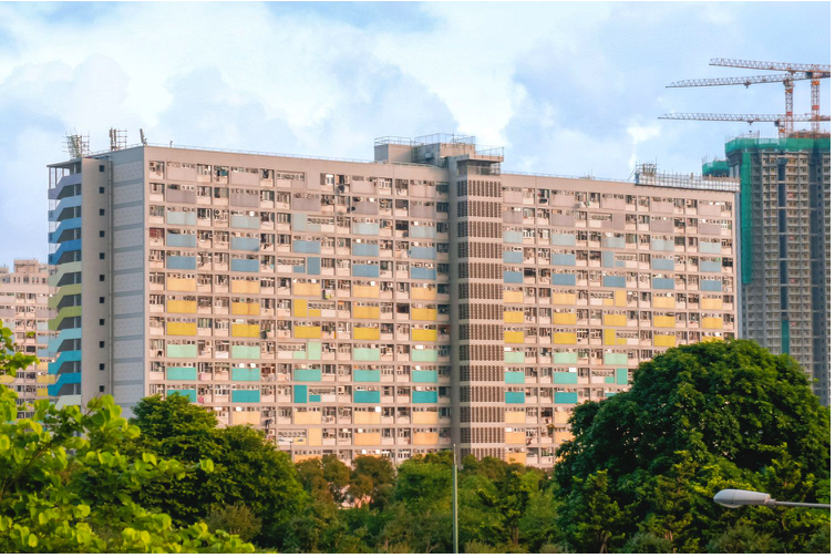
Last but not least, the fourth photo is of the Choi Hung (rainbow) estate block in Hong Kong. Built-in 1964, this estate, along with basketball courts, was made to provide affordable housing for people in the area. Decades later, as well as housing thousands of people, it has now become a popular Instagram spot for tourists. 


The reason behind choosing these particular photos is due to the symmetry that they have (exception being the third photo which has three buildings as opposed to two or four).  They are all made up of the repetition of shapes, lines, which has created a man-made pattern. Some of the buildings also have colour, which adds even more of perception to them, and is overall aesthetically pleasing.


References

Michael Paul Lewis

https://www.michaelpaullewis.com

Agota Kadar

https://www.instagram.com/agota_kadar

https://www.architonic.com/en/project/max-dudler-jacob-and-wilhelm-grimm-centre/5103579

Paul Green 

Choi Hung Estate

https://www.theblondeabroad.com/how-to-find-choi-hung-estate-basketball-court-in-hong-kong/


Nolan, C. (2010), Inception, Warner Bros. Pictures, United States, United Kingdom 


Comments

Popular posts from this blog

Reflection on the first year

As the first year has gone by, I would say that I've had many highs and lows from my Digital Media Foundations. I started the year off rather excited, especially since I did not have any expectations of what the course would be like. When I first heard that we were going to be writing on blogs, I was slightly nervous. The idea of having to publicly write down my experiences, along with my thoughts and feeling was slightly scary to me because I wouldn’t know who would be seeing my blogs. However, as time went by, I slowly but surely got used to writing in my blogs. I thoroughly enjoyed learning how to do new things, such as using Stop Motion, audacity, Premiere Pro, and more. I will admit to finding some of the software difficult to use, such as photoshop, and Illustrator. However, I am adamant to keep on learning how to use them, so that I can be able to create more projects. My favourite project/ assignment was probably using Stop Motion. Even though it took such a long time, I re...

Poster design

Feeling slightly uneasy about Adobe Illustrator, I still went ahead to use it to make my poster. It was going well, until it wasn’t. The Poster was supposed to be for our Lecturer’s nephew, who is a musician (who plays the classical guitar). He was having a concert in France, and wanted an advertisement for it (this being the poster).  My original idea was to have an image of a classical guitar, and both Charlie Richardson and the other half to his duo Anne-Lise Vaumoron in the guitar with details of the event around it. I had decided to use elements of Tony Harmer's video to help with my idea. However, I found it very difficult to create and ended up having to start again several times. By the fifth time, I had decided to give up my original idea. Unfortunately, I came to the decision to leave out the picture of Richardson and Anne-Lise. To be completely honest, I was not the biggest fan of the photo options we were given for the poster, so I wasn’t too disappointed. In the end, m...

Another trip to a museum

I wanted to visit two museums after the classes I had for the past couple of weeks. The first museum I went to was the Saatchi gallery. Seeing as I went there rather spontaneously, I was not able to go to any of the private exhibitions. However, they did have one free exhibition, named Studio: Response. It was an exhibition collaborating with three artists, Luke Hannam, Tom Norris and Luke Routledge.  Luke Routledge did the sculptures, Tom Norris created the ceramic vases and Luke Hannam painted the canvas art. My favourite was the art done by Luke Hannam, especially since it was painted on canvas, which is something I had never seen before in a gallery. Seeing the various patterns, colours and textures that the artists had used were rather fascinating to me, and I thought the exhibition was quite nice. To be completely honest, I'm not entirely sure what the purpose of the exhibition was, but nevertheless, I found the art to be interesting, and I will definitely look further into t...