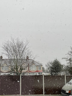
For the first brief, I was asked to create a photo spread for an online newspaper/ magazine which would be shown by using five photos. The subject/ theme that I decided to do is “Earth in a year”. The five photos that I chose are supposed to represent how the Earth can look during all four seasons (and showing the stereotypical weather that may come in that certain season). The type of publication that I would do this photo spread for would be a nature magazine, such as National Geographic, or BBC wildlife. The reason why I decided to choose this theme is due to the fact that as the year is coming to an end, I wanted to look back at how the atmosphere looked while being in various seasons in the year. This particular year has had many weathers, and I wanted to show the many aspects that the Earth can have. The first picture represents spring, (when flowers typically begin to blossom) the second is summer, (the sun setting after a hot day) the third and fourth photos are autumn (and the transition to the colder weather) and lastly, the fifth photo represents winter (on a cold snowy day). All the photos had been taken on a phone camera, but some of the pictures had been edited, by using photoshop to remove any unwanted background objects, people, etc, and to also do things such as adjusting the brightness, saturation, warmth, and overall colour to improve the photos.
In order for me to have been able to make my documentary, I had to know how I was going to put it together. And for me to put it together, I had to use software (this particular one being Adobe Premier). And who was going to help me? None other than LinkedIn learning! It was recommended to use LinkedIn learning as a way to learn how to use software such as Photoshop, Adobe Premiere, and more. The specific video I watched was learning Premiere pro, by Ashley Kennedy. The video is sectioned into various parts, so if the viewer doesn't want to watch the whole video, they could automatically watch the part of the video they need to know how to use the editing app. The first video was 94 minutes, and the second was over seven hours. To be completely honest, the first video was all I really needed to watch, but if I wanted to know about anything in detail, such as editing in music, I would watch the second video. As someone who has not used Premiere Pro before, I found the videos very h...


Comments
Post a Comment